
Typography is the art and technique of arranging and designing text in a visually appealing and effective way. It plays a crucial role in graphic design, web design, advertising, and various other forms of communication. Typography involves selecting fonts, font sizes, spacing, and other typographic elements to convey a message or evoke a particular mood. Here are the key elements and rules of typography for beginners:
Typography Elements:
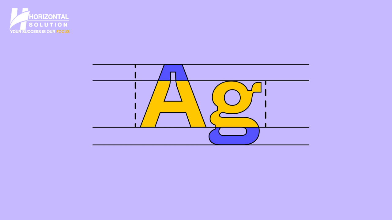
- Typefaces (Fonts): Typefaces are the different styles and designs of characters (letters, numbers, and symbols) within a font family. Common examples include Arial, Times New Roman, and Helvetica.
- Font Families: A font family consists of various styles and weights of a typeface, such as regular, bold, italic, and more. Each family maintains a consistent design.
- Font Size: The size of the typeface is typically measured in points. The choice of font size is crucial for readability and visual hierarchy.
- Line Height (Leading): Line height refers to the vertical space between lines of text. Proper line height improves readability and the overall appearance of text.
- Kerning: Kerning involves adjusting the space between individual character pairs to create a visually pleasing and balanced look.
- Tracking: Tracking adjusts the overall spacing between characters in a text block. It can be used to tighten or loosen the spacing.
- Hierarchy: Typography should establish a hierarchy to guide readers through the content. Use variations in font size, weight, and style to differentiate headings, subheadings, and body text.
- Alignment: The alignment of text can be left-aligned, right-aligned, centered, or justified. Alignment affects the flow and appearance of text.
Typography Rules for Beginners:
- Choose the Right Typeface: Select a typeface that complements the message and the overall design. Consider readability and the intended tone.
- Maintain Consistency: Use a limited number of fonts and font families throughout your design to maintain visual consistency. Typically, two to three typefaces are sufficient.
- Hierarchy is Key: Create a clear hierarchy by using different font sizes, weights, and styles to guide readers through your content. Headings should stand out from body text.
- Whitespace Matters: Adequate spacing, both in line height and margins, is essential for readability and overall aesthetics.
- Avoid Clutter: Overusing decorative fonts or too many type styles can result in cluttered and confusing designs.
- Legibility: Prioritize legibility over creativity. Ensure that your chosen typefaces are readable, especially for longer content.
- Consider Branding: Your typography choices should align with your brand identity and message. Establish brand guidelines for consistency.
- Use Contrast: Contrast in font size, weight, and style helps create emphasis and visual interest.
- Test and Revise: Always review your typographic choices and layout to make adjustments as needed. Seek feedback from others.
- Learn from Others: Study well-designed materials and learn from established typographic principles to improve your skills.
Typography is a powerful design tool that can greatly impact the effectiveness and aesthetics of your communication materials. By understanding the key elements and following these basic rules, beginners can create visually pleasing and impactful typographic designs.